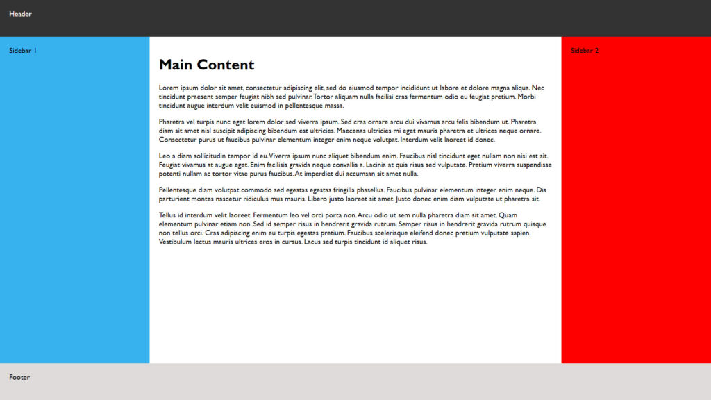
CSS Flexbox page layout
Panchal Tech October 19, 2022

It might be a little early to throw away your CSS floats, but thanks to the new CSS Flexible Box Model — better known as Flexbox — simple, sane layout tools will soon be part of your web development arsenal. Browser support isn’t complete yet, but for those who’d like to push the envelope, Flexbox already works in three major browsers, with more coming soon.
HTML5 AND CSS 3 offer web developers new semantic tags, native animation tools, server-side fonts, and much more, but that’s not the end of the story. In fact, for developers slogging away in the web design trenches, one of the most promising parts of CSS 3 is still just over the horizon — true page layout tools.
While it’s possible to create amazingly complex layouts using tools like CSS floats, positioning rules, and the odd bit of JavaScript, none of those tools were actually created explicitly for laying out content, which is why it’s amazingly complex to get them working the way you want across browsers.
Soon, however, you’ll be able to throw out your floats and embrace a better way — the CSS Flexible Box Model, better known as simply Flexbox. Flexbox enables you to create complex layouts with only a few lines of code — no more floats and “clear fix” hacks.